How to create Custom Tooltips in Power BI for Wellness & WHOOP trends
Recently we built a reporting suite for one of our customers that let them analyse Game, GPS, Wellness and WHOOP data all in a single report.
The Wellness and WHOOP streams both update daily, wellness via player surveys and WHOOP via their team portal.
The staff wanted something simple:
“Show me the latest numbers, tell me if anything is off, and give me quick context so I know whether to worry or not.”
Anyone who has dealt with daily wellness or wearable health data knows the problem. One “bad” score can mean something… or it can mean absolutely nothing. Without context, it’s impossible to tell.
And when you’re dealing with 10+ measures across 30+ athletes, trying to visualise daily values and longer-term trends on the same page gets messy.
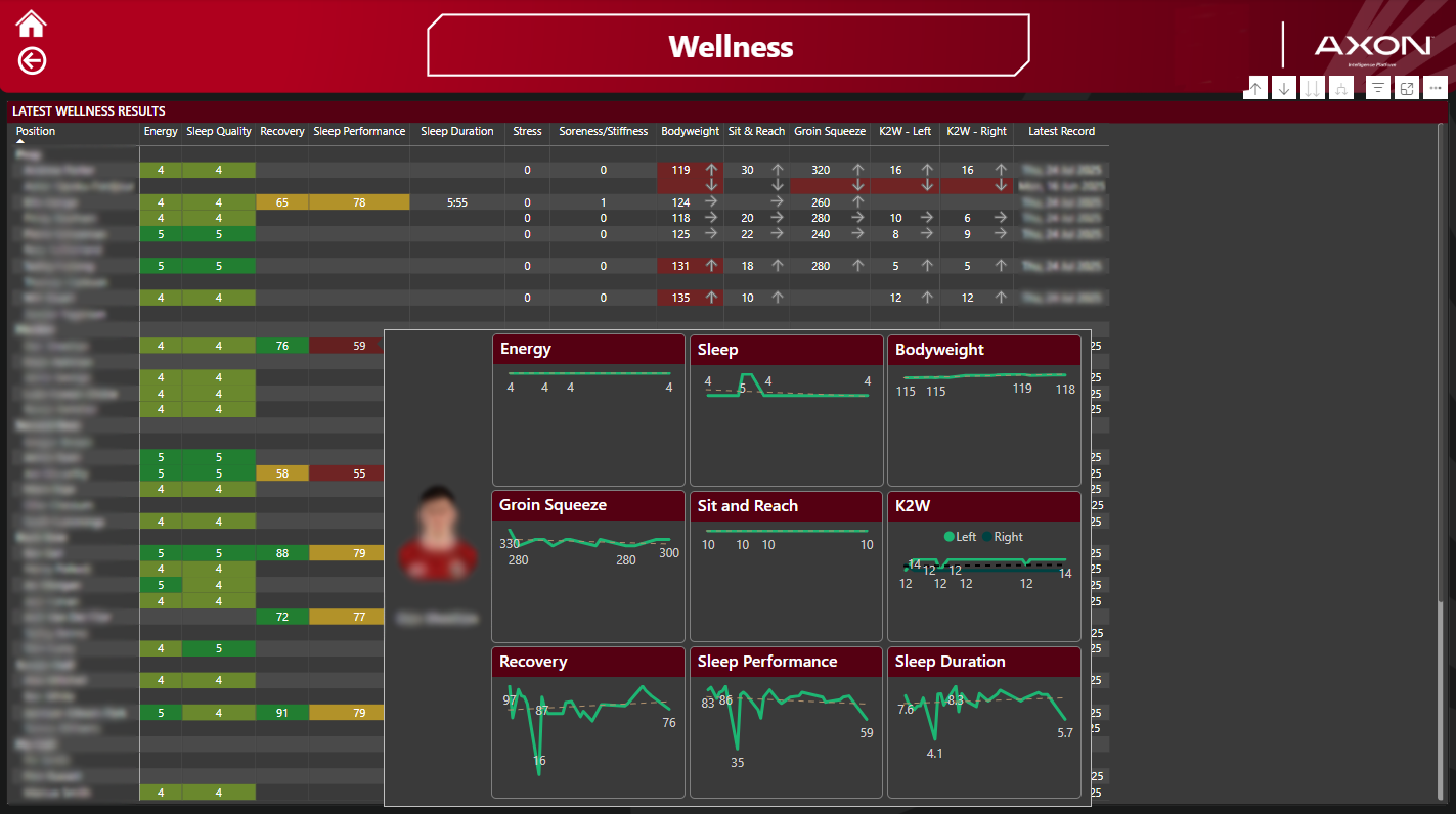
To solve it, we built a report page showing the latest daily record with indicators for each measure.
For WHOOP, we used the same colour style people recognise from the WHOOP app.
For wellness, we simply highlighted values that were above or below thresholds defined by the team using red cells and simple arrow icons.
But the real value was in a custom tooltip.
When staff hovered over any measure, the tooltip displayed a clean line chart of that metric over time. In one second, they could see whether today’s value was just an outlier or part of a trend they needed to act on.
In this article, I’ll show you exactly how to build a custom tooltip and attach it to a table in Power BI.
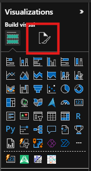
1. Create a Tooltip Page
Start with a report that already has your data loaded and a table visual similar to this one.

Create a new report page, then open the Format your report page menu (location varies slightly depending on your Power BI version).
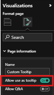
2. Enable Tooltip Mode
Under Page Information, give the page a name and turn Allow use as tooltip to On.
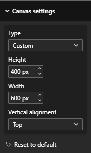
Power BI will automatically resize the page to 240 × 320px. For this example, we’ll switch it to 400 × 600px:
Go to Canvas Settings
Change Type to Custom
Adjust the height and width
3. Add Line Charts for Each Measure
Now drop in the line charts you want the tooltip to show, in this case, a mix of WHOOP and Wellness metrics.
Each chart will update automatically when the tooltip filters to an athlete, so don’t worry about it looking wrong at this stage. Right now it’s showing all players, that’s OK.

4. Add a Player Image (Optional but Highly Recommended)
It’s always worth including the athlete’s photo.
It helps staff instantly connect the data to the person, and in practice it gets people engaging with the report more as the data becomes human again.

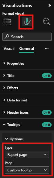
5. Apply the Tooltip to Your Table
Head back to your main report page.
Select your table
Open Format your visual
Go to Tooltips
Change the Type to Report page
Select the tooltip page you just created
6. Hide the Tooltip Page
Finally, hide the tooltip page so it doesn’t appear as a normal tab in your report.
Right-click the page tab and select Hide.
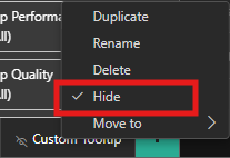
It will still work perfectly as a tooltip even though it is hidden
Now, when you hover over an athlete’s daily measures, you’ll see a clean trend view right beside the latest results — no cluttered visuals, no scrolling, and no guessing.
Now you will see, as you hover over each athlete in the table it will filter the tooltip page and show you trend information for the records in the table.