
3 ways to improve long-term analysis of performance data
About two years ago I started wearing a Whoop to track my fitness metrics. At the time I had been managing diabetes for about 12 years and was also coming to terms with getting older. Both were affecting my day-to-day life so I wanted a clearer understanding of how my health was trending over time, not just how I felt on a given day.
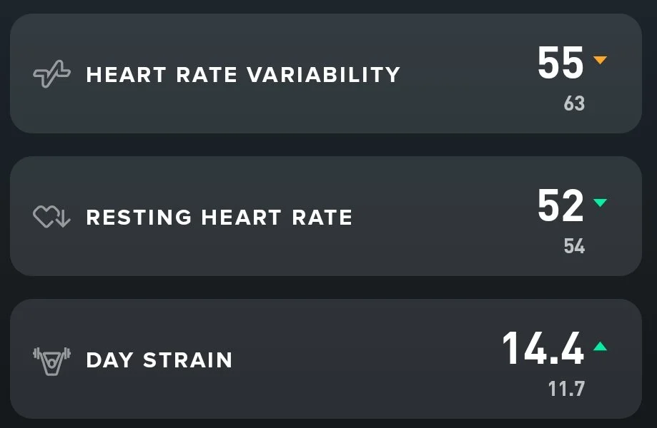
Initially, I used the Whoop mobile app in isolation, focusing almost entirely on daily results. There are countless metrics available, and depending on your goal you can easily find yourself concentrating on one or two in pursuit of improvement. Over time I have settled on HRV, Resting HR and Daily Strain.
Alongside this, I also wear a Continuous Glucose Monitor (CGM), so these three Whoop metrics give me a solid overview of how my body is coping relative to my personal health goals.
However, with any wearable device there is an inherent risk of over-focusing on daily measures. I have seen friends become obsessed with individual sleep scores or HRV readings. One day they would feel encouraged, the next discouraged. In some cases, the pressure became counterproductive and they stopped wearing the device altogether.
The issue was not the data. It was the way it was being interpreted.
That led me to rethink how I was analysing my own metrics. Instead of reacting to daily values, I wanted a structure that would help me understand longer-term direction.
Here are three changes that significantly improved how I analyse performance data that can be applied to other performance situations.
1. Combine relevant metrics for context, not isolation
The first step was to view my three chosen metrics together rather than in isolation.
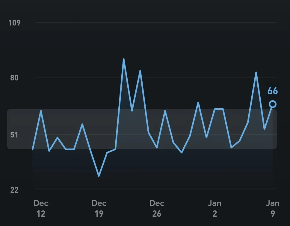
The Whoop app allows me to see daily data across all three metrics. It also allows me to see longer-term trends, but typically one metric at a time. Neither view gave me what I really needed: comparative context across metrics over time.
I created a single chart containing HRV, Resting HR and Daily Strain together.
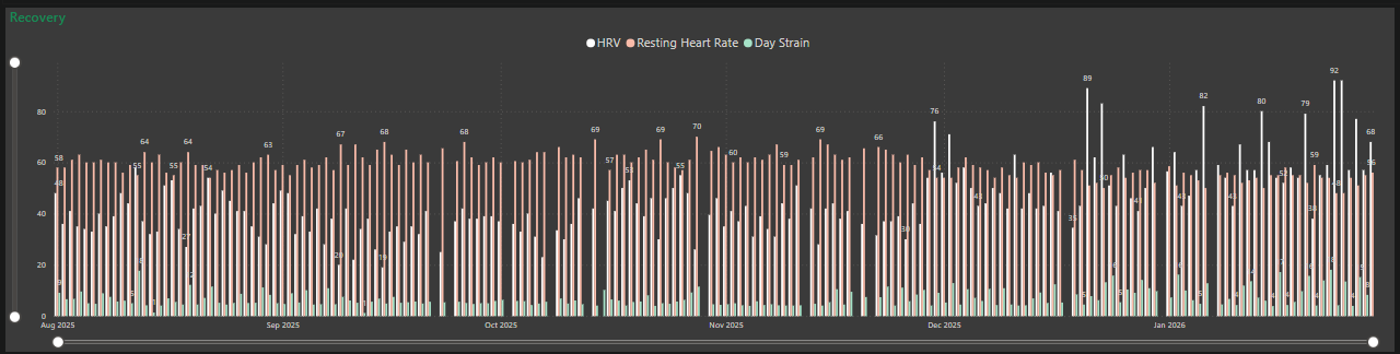
This allowed comparison, but it still had limitations. The daily bars made it difficult to identify clear trends. While I could see fluctuations, I could not easily determine whether I was improving, deteriorating, or staying consistent.
Performance metrics rarely operate independently. HRV without strain lacks context. Strain without recovery is incomplete. Meaningful analysis requires viewing related variables together.
2. Choose the right calculation and chart for the decision
Once I had the metrics together, I had to consider how to calculate “average”.
As a diabetic, I measure blood glucose constantly throughout the day. However, when assessing long-term control, my doctor relies on an HbA1c test, which reflects a 90-day average.
That time period filters out short-term volatility and highlights sustained control.
I decided to apply the same logic to my Whoop metrics and calculate a rolling 90-day average for HRV, Resting HR and Daily Strain.
To visualise this properly, I moved from a bar chart to a line chart. A line chart is better suited to understanding direction and trend. It allows movement over time to be seen clearly and reduces the visual noise created by daily variability.
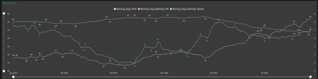
This change highlighted patterns that were previously hidden. Relationships between strain and recovery were easier to interpret. The analysis shifted to understanding how long-term activities effected results in HRV and HR.
The underlying lesson is that the format of your analysis should match the question you are trying to answer.
3. Remove visual distortion from your analysis
Even after improving the calculation and chart type, there was still a risk of misinterpretation.
By default, charting software often adjusts the Y-axis to tightly fit the data range. In my case, one axis started at 30 and the secondary axis started at 2. While technically correct, this exaggerated the apparent magnitude of change.
To correct this, I set both Y-axes to start at zero. This provided proportional context and reduced visual exaggeration. The trends more tightly reflected reality and relationship between the metrics
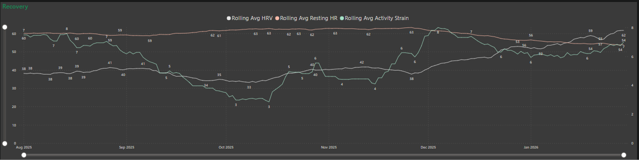
This step reinforced that visual framing influences perception. If the scale exaggerates volatility, it can lead to misinterpretation.
Conclusion
What began as an attempt to better understand my own health became a broader lesson in analytical discipline.
In this case, Daily HRV, Resting HR and Strain readings are useful. They provide awareness. But awareness alone does not create clear understanding.
When you combined relevant metrics, analyse them over a meaningful time period, and removed visual distortion, the story becomes clearer.
The relationships between strain, HRV and heart rate were easier to interpret. My decisions became less reactive and more deliberate.
Long-term performance, whether in health, training or business, is not defined by isolated data points. It is defined by trends over time. By smoothing noise, selecting appropriate visual tools and presenting data proportionally, we reduce bias and improve the quality of our decisions.
Sport has access to more data than ever before. The advantage will not come from collecting more of it, but from analysing it with greater discipline.