

WHOOP, Garmin, Oura, Apple Health and Samsung connected automatically into your own data warehouse, alongside GPS, game data, wellness and medical. Then ask it anything.
Coming June 2026 | Axon Pulse mobile app launches soon. Every wearable, captured automatically.
WEARABLES
Axon makes Wearable Data useful for the whole performance staff.
THE PROBLEM
Wearable data is trapped in consumer apps.
Wearables generate some of the most valuable signals in performance. Recovery scores, sleep quality, strain, HRV trends. The problem isn't the data. It's that it stays trapped in consumer apps designed for individuals, not for performance teams managing squads of 30 to 50 athletes.
Most staff end up logging into a wearable app, manually exporting CSVs, and trying to make sense of one athlete at a time. Disconnected from GPS loads, match data, and medical status. The insight is there. Getting to it takes too long and tells only part of the story.
WHAT AXON DOES DIFFERENTLY
One app. Every wearable.
Your warehouse.
Axon Pulse connects directly to each athletes wearable data on their phone and pulls that data automatically into your Axon data warehouse, alongside GPS, game data, wellness forms, and medical records. No manual exports. No spreadsheets. No chasing athletes to sync their devices.
Integrating leading wearables like WHOOP, Apple, Samsung, Garmin and Oura for seamless data collection.
Streamlining processing with an automatic data flow with no manual exports or spreadsheets needed.
The result:
Wearable data inside the same warehouse as your GPS, game, and medical data. Decisions you used to make on one signal at a time, made on the full picture.
Unified data warehouse, consolidating diverse datasets like GPS, game and medical records for analysis.
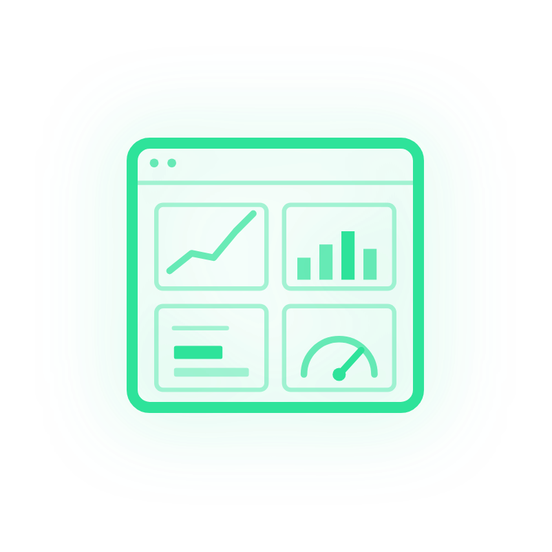
ASK AXON ON YOUR WEARABLE DATA
Two access points. Same wearable data.
Ask Axon puts AI directly on top of your connected wearable data. Two ways to use it, depending on who's asking.
01 - ASK AXON IN HQ
For anyone who needs a quick answer.
A coach checking recovery before Thursday's session. A physio pulling a sleep summary before the morning clinic. A performance director who wants a picture of squad readiness before a selection conversation.
Open Axon HQ, ask in plain English, get your answer. No AI tool needed.
EXAMPLE QUESTIONS
Which players have an elevated 7-day HRV trend going into the weekend?
Show me sleep duration vs training load across the last block.
Who's recovering below their 28-day baseline?
ASK AXON VIA MCP
For analysts building repeatable workflows.
Connect Claude, Gemini, Copilot, or any MCP-compatible AI tool directly to your Axon warehouse. Run multi-week trend analyses. Build flagging workflows. Combine wearable, GPS and match data in one query.
No exports. No SQL. No file uploads.
EXAMPLE WORKFLOWS
Weekly readiness report combining HRV, sleep, load and game minutes for every player.
Trend flags for athletes whose 14-day recovery is below personal baseline.
Does sleep <6h on Wednesday predict elevated load response on Friday?
Your wearable data never leaves your environment. Ask Axon gives your AI a structural map of the data, not the data itself. The AI writes a query, the query runs on your Snowflake warehouse, only the result comes back.
What Your Staff Can See
-
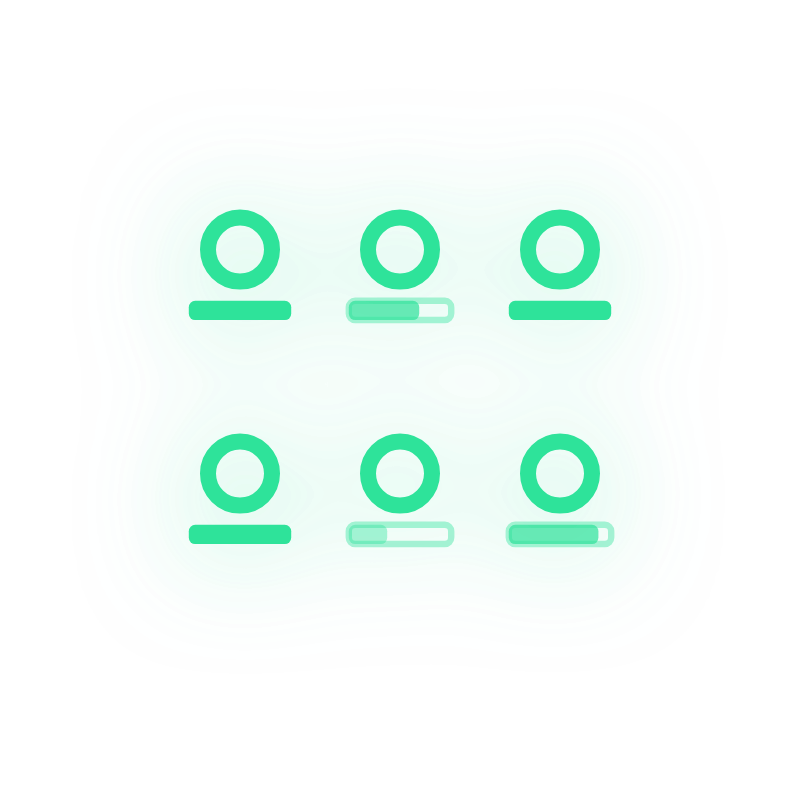
Squad Readiness At A Glance
See recovery scores and readiness signals across the full squad, not athlete by athlete.
-

Load and Recovery in Context
Align wearable data with GPS training loads and match demands to understand whether recovery is tracking with what you're asking of athletes.
-
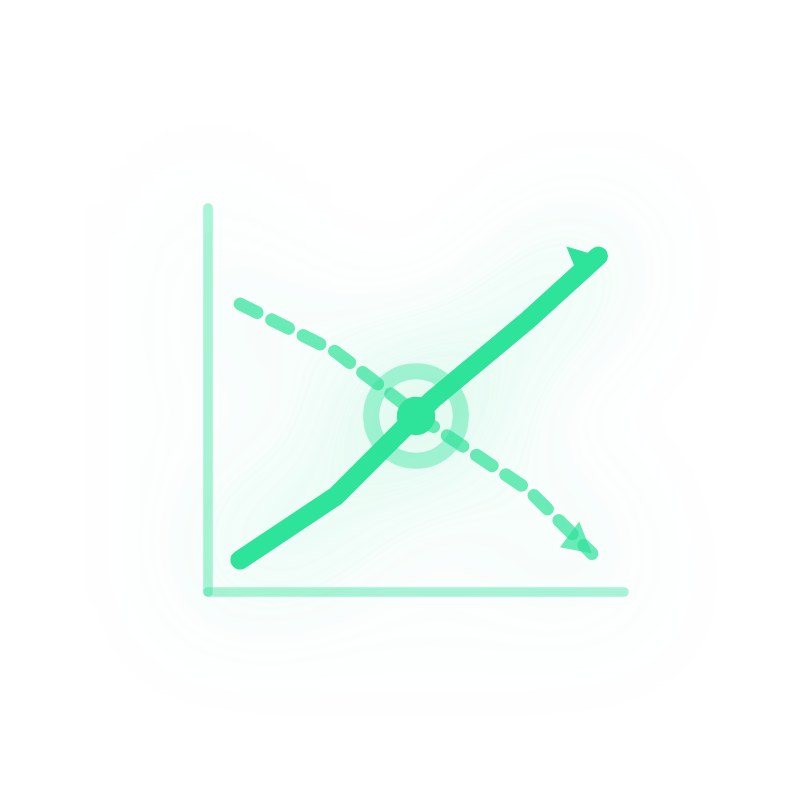
Trend Analysis
Track individual and group patterns over weeks and months to identify athletes whose recovery is declining before it becomes a problem.
-

Lifestyle and Performance Correlation
Connect sleep, strain, and recovery patterns with performance outputs to build a more complete picture of each athlete.
-
Customisable to Your Environment
Templates are fully editable. Define the metrics that matter to your programme, set your own thresholds, and build views that match how your staff actually work.
CONNECTED WEARABLE PLATFORMS
The devices your athletes already wear.


Don't see your wearable? We add new integrations regularly. Tell us which one you need.
COMING SOON MID 2026
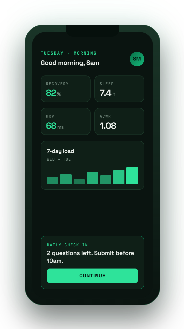
Axon Pulse. Every athlete, every wearable, one app.
Axon Pulse is the athlete-facing mobile app launching in June 2026. It captures wearable data automatically from any device the athlete already uses — no manual exports, no per-week sync chase.
Connect any wearable. Direct OAuth links to WHOOP, Garmin, Oura. Apple HealthKit and Google Health Connect passthrough captures every other device the athlete syncs to their phone.
Wellness check-ins in the athlete's pocket. Daily wellness, soreness, sleep, mood. Submitted in seconds, flowing straight into your warehouse.
Athlete-facing load and recovery views. Players see their own ACWR, recovery trends, and load history. They engage with the data instead of fighting it.
TURN WEARABLE DATA INTO DECISIONS
See it on your data.
Request a trial to see how Axon connects wearable signals with the rest of your performance data, and how Ask Axon turns it into answers your staff can act on.